Yellowstone Packaging & Retail Guide.
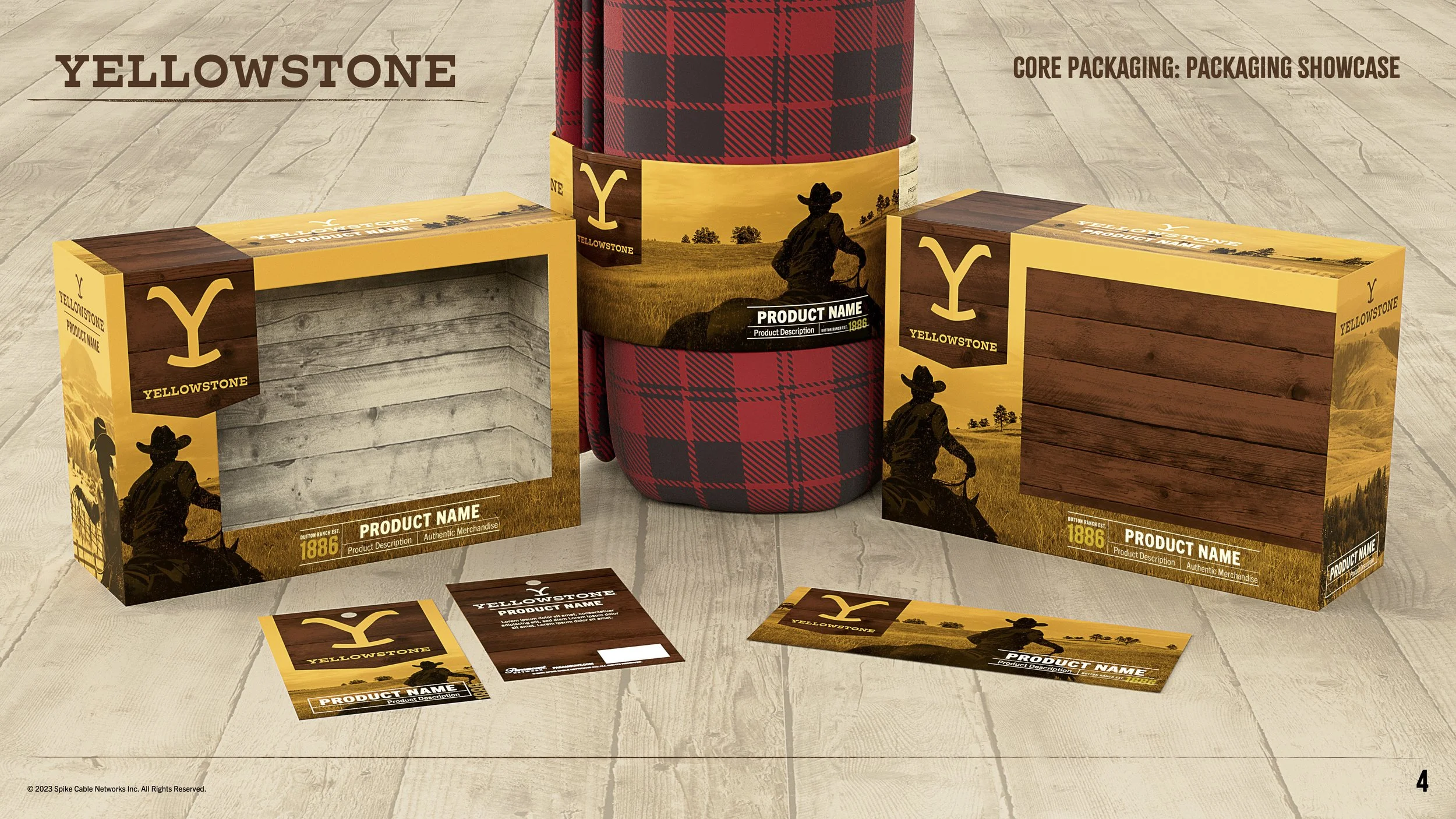
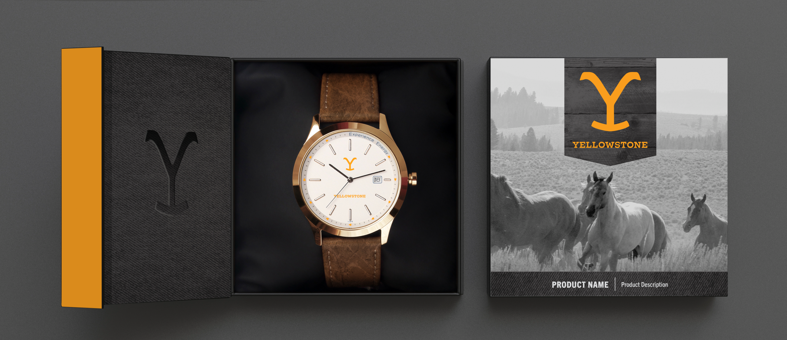
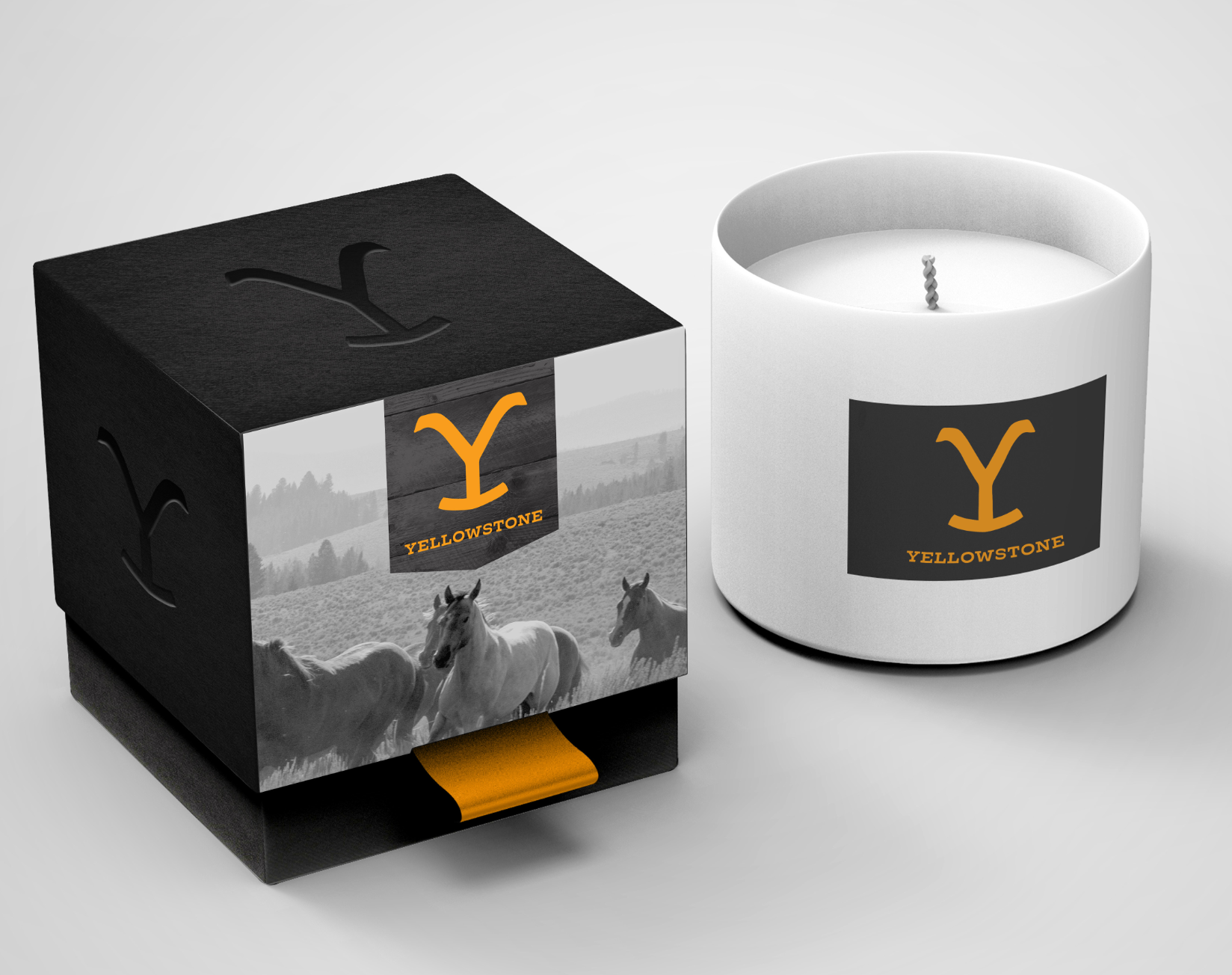
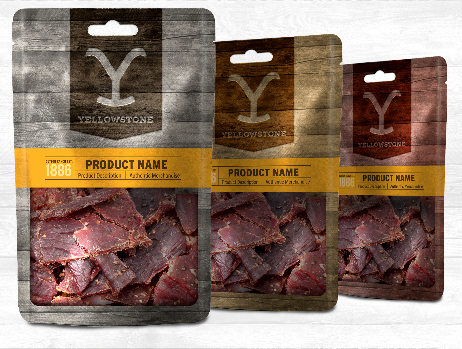
With an explosive growth in popularity, and an opportunity to expand the show into a consumer products lifestyle brand, a flexible packaging and retail guide was needed to unsure brand continuity and authenticity for this emerging franchise.
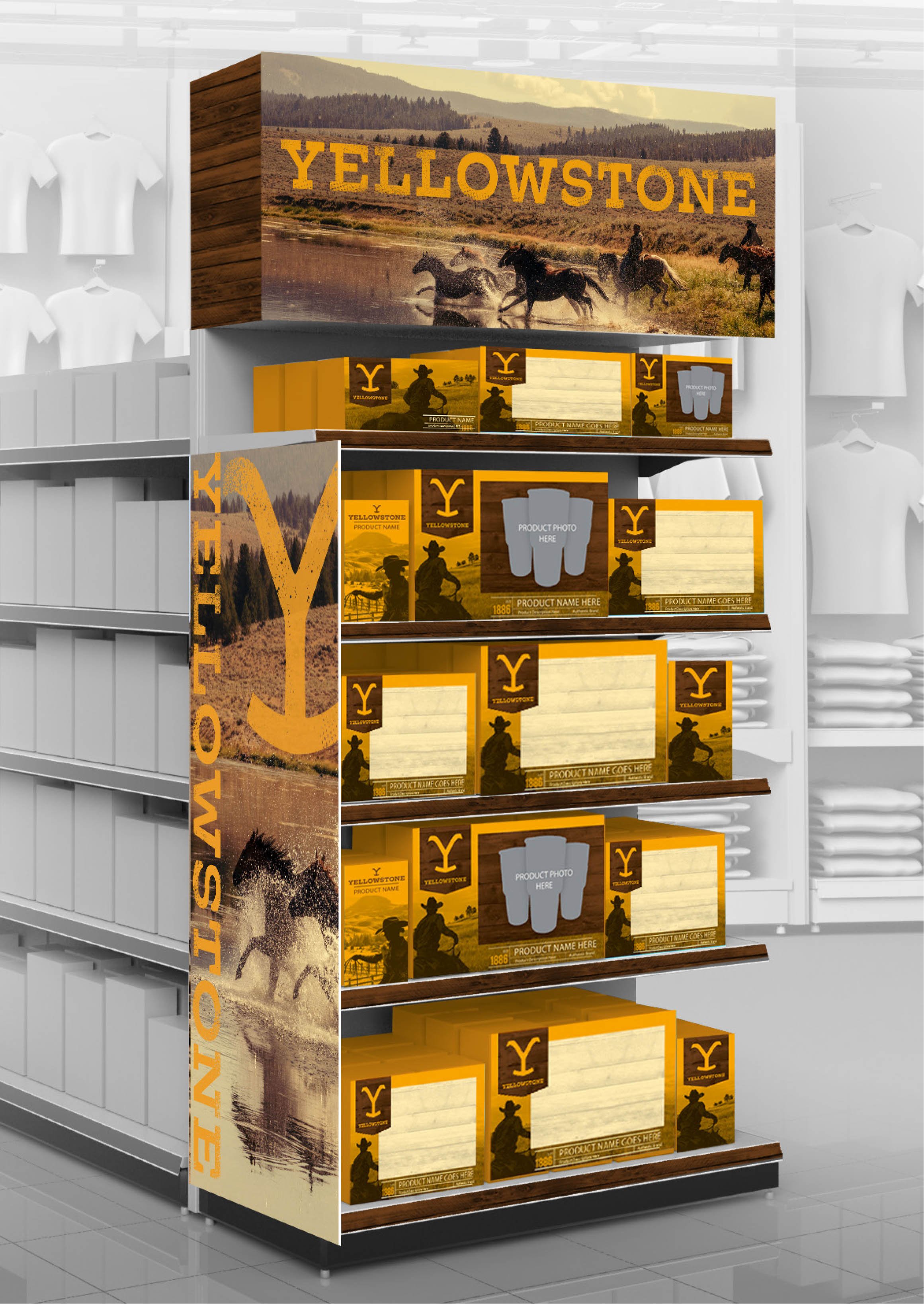
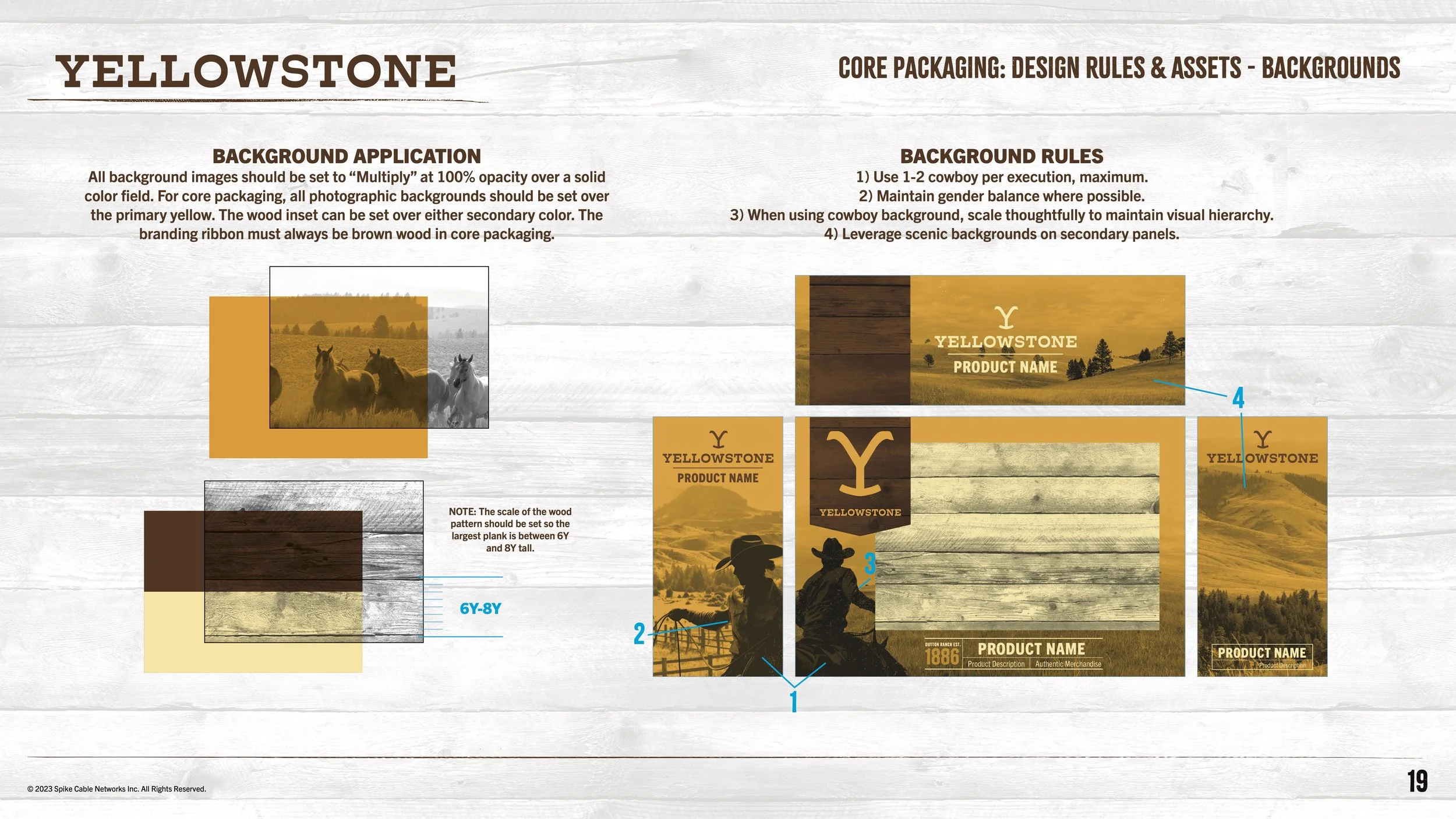
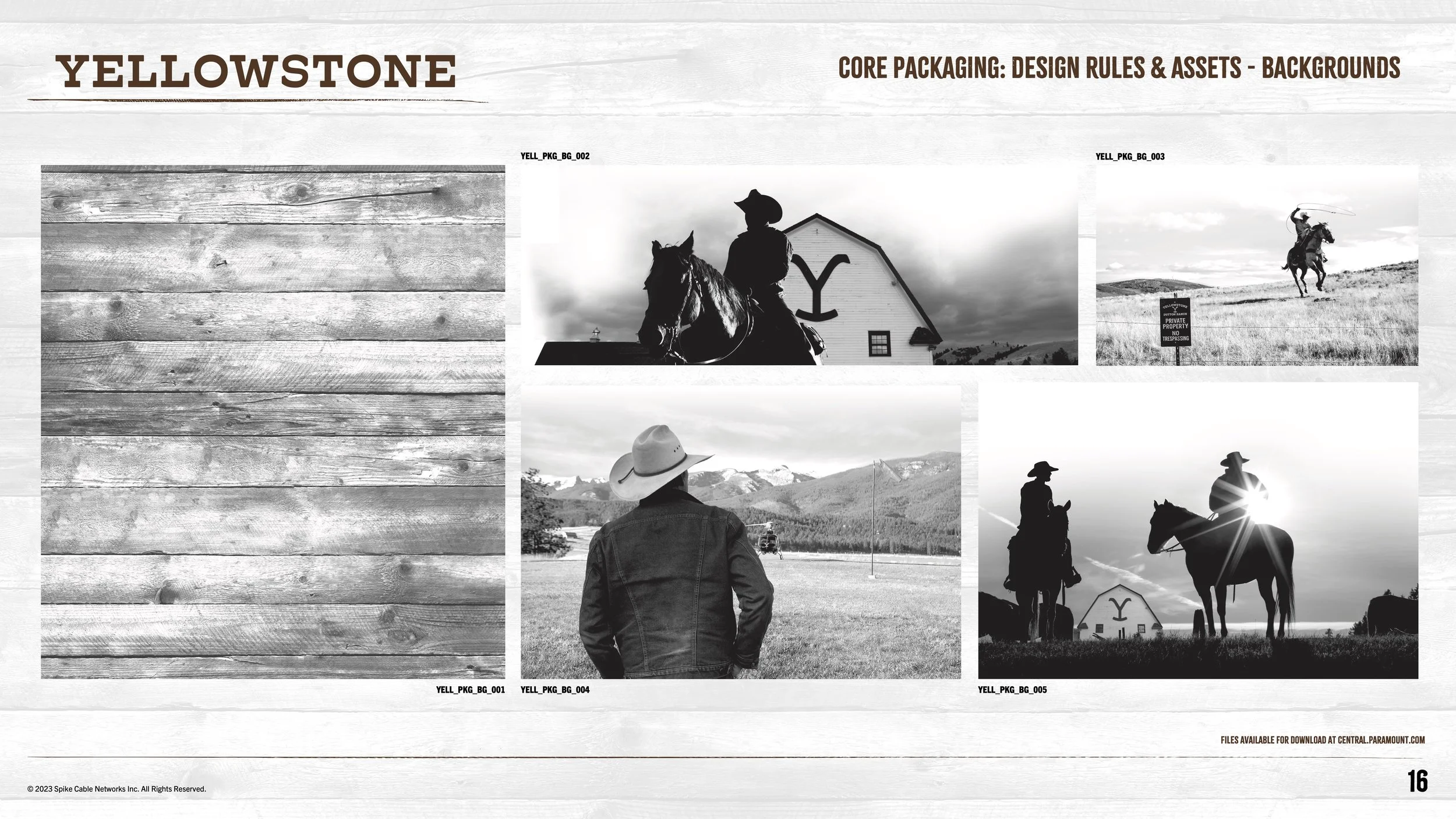
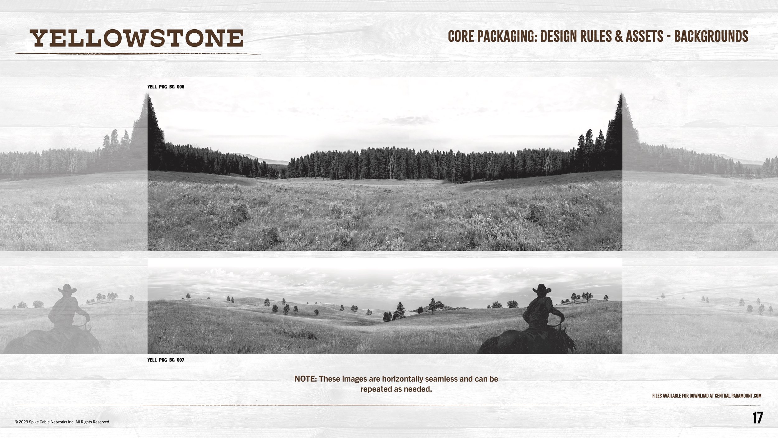
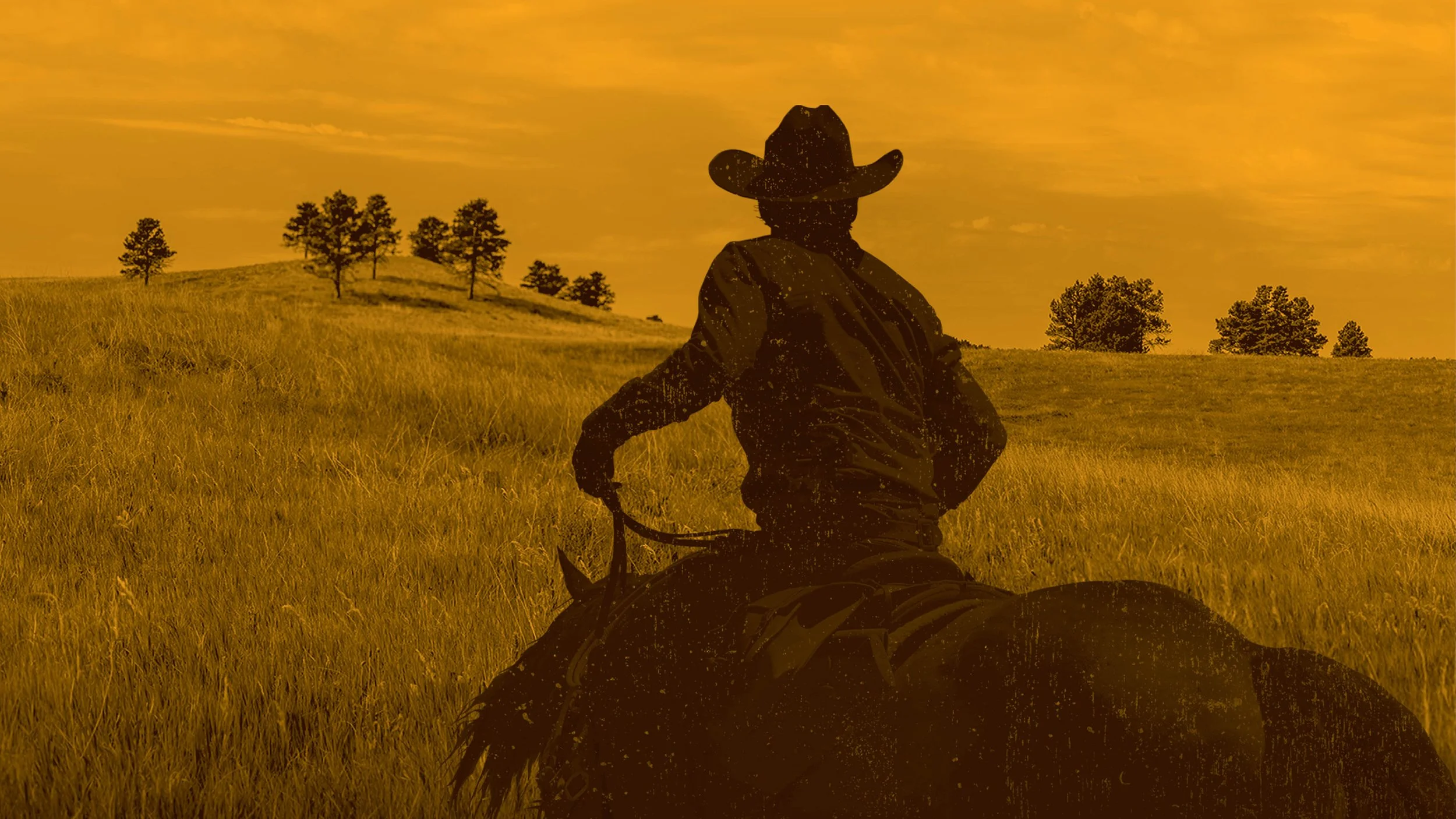
The design sensibilities play off of the show opening sequence, using dark silhouetted ranchers, steer, and spirited horses over the key show color, to capture the authenticity of ranching life as portrayed in this series. Backgrounds and textures that showcase the rugged Montana landscape add an epic layer to the consumer products storytelling.
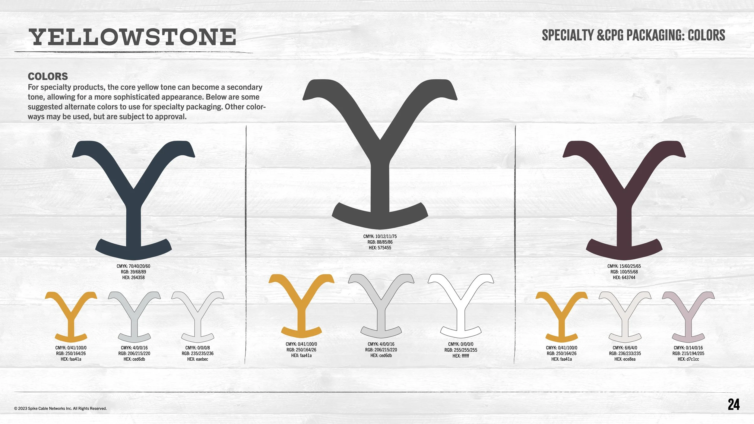
These textures, backgrounds, and colors were designed to adjust for market needs, becoming more bespoke for specialty spaces, and adjust for specific lines of business like health and beauty.
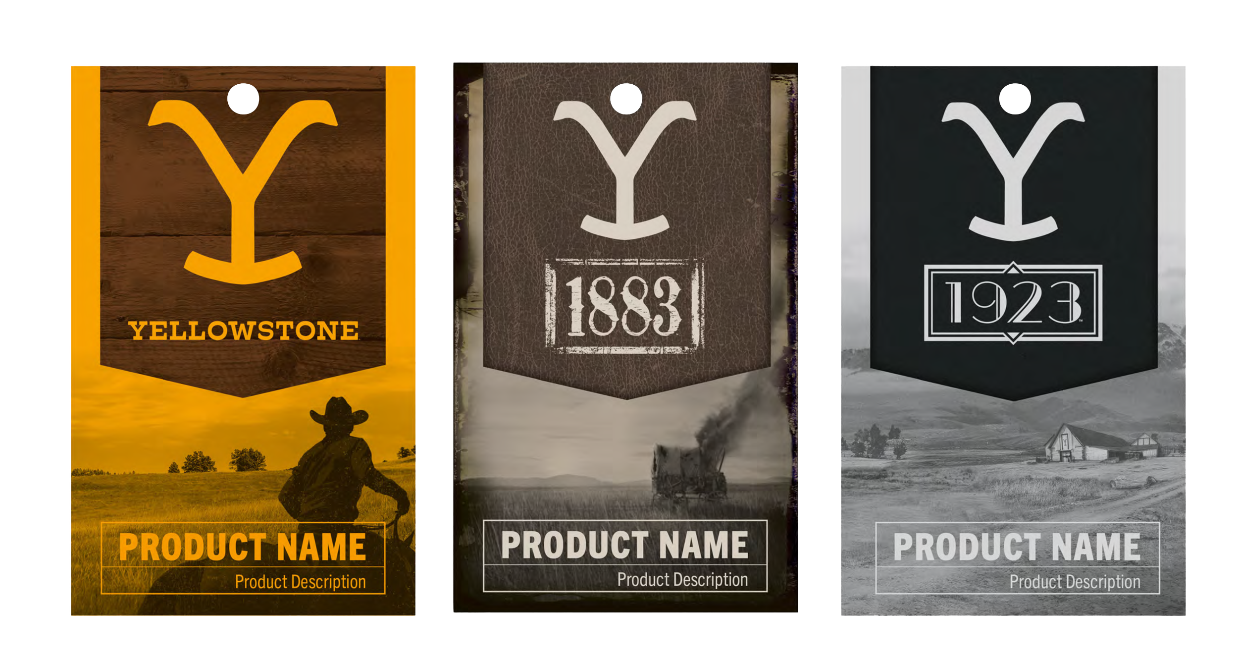
A structured brand space was used to allow for a franchise connection across the Yellowstone spin-off series.